Colours can affect you, your home and your work environment. Emotions and moods swings could be the effect of the colour that surrounds you. You could lose your temper faster because you are surrounded by red walls. Or keep your calm longer all because of blue walls. It’s surprising what colours can do so pick your colour carefully. We will help you reach the colour best for you.
Knowing how color is commonly used in design projects is another helpful approach to selecting color. The design professionals constantly monitor the latest research on psychological and physiological responses to color to create effective and stimulating design. As you think about your project, consider the following uses of color.
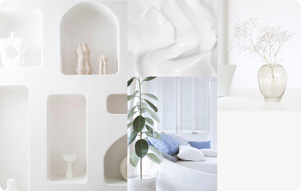
White is the most neutral of all colors and gets along well with practically any other shade. Elegant and sophisticated, it can be used to open up spaces and as a backdrop for kitchens, baths and any room that requires a crisp, clean, well-designed look.
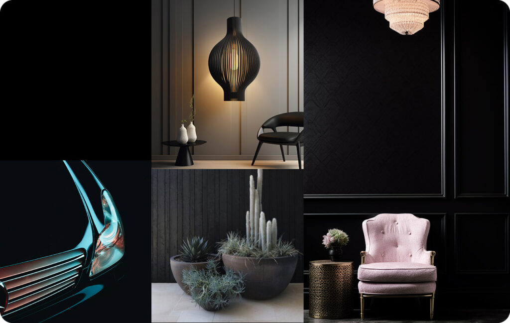
A dramatic color, black is often used as an accent to embolden other tones.It works well with white to create a classic, timeless motif. You can also use black with jewel tones for a sparkling magical appearance.
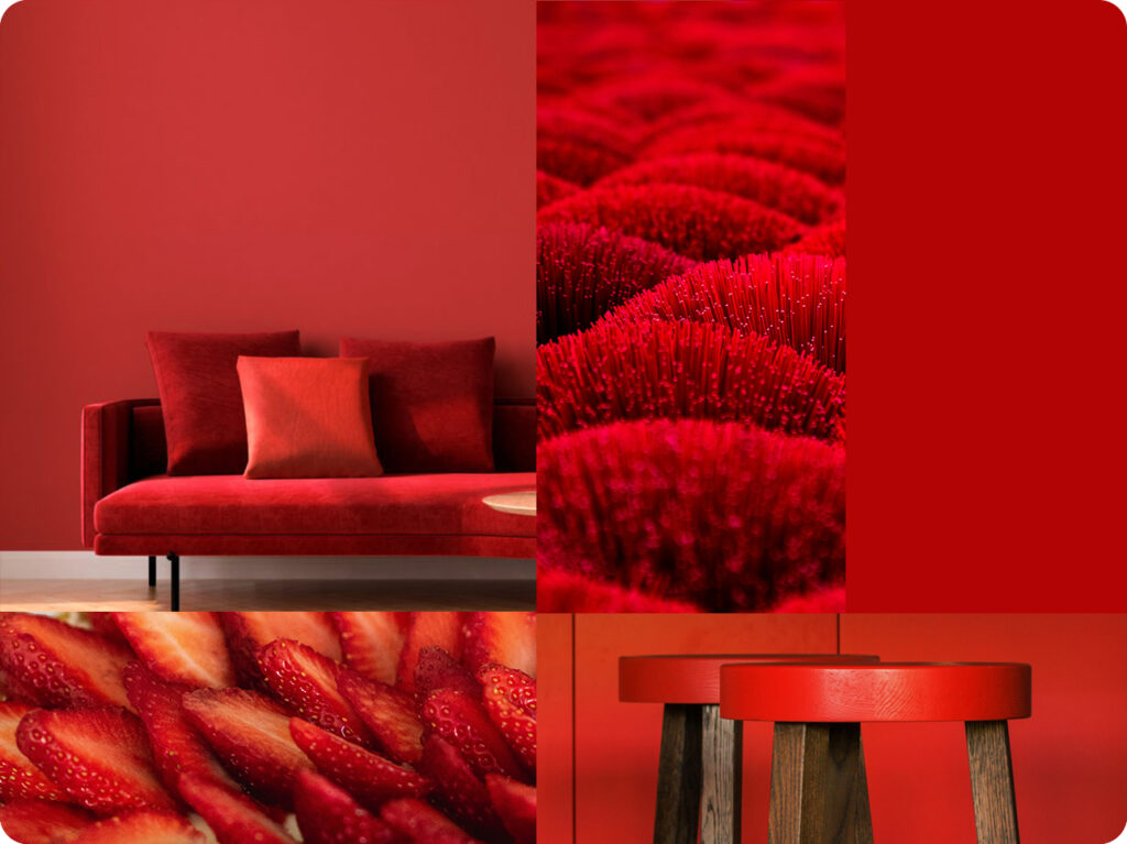
What is it that you are looking for, for your interiors? Something cozy and warm or something that whets your appetite and makes you feel grand? Something which invokes luxury or makes you feel powerful? Red. That’s the colour which you should pick if it’s any of the above you are looking for. Be it a bedroom a living room, a restaurant or a corporate dining facility, the bold colour has more personal associations than any other. For those prone to mood swings, red is a strict no no.
The strongest energy of any color, red is also best used in rooms that require interaction, such as dining rooms, where it is thought to stimulate the appetite. Red also adds drama to dens, hallways and powder rooms.
Effect of the colour red:
• Increases energy level • Commands confidence • Encourages action • Makes you fearless
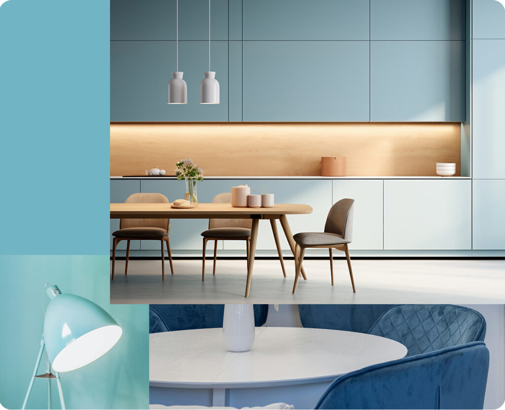
Feeling blue? Well, the colour blue on your walls could change your mood. Good for your health, blue has healing properties like the ability to lower blood pressure and slow down respiration.
You can create a conservative office environment with a dash of blue. Recreate the serenity and calm of the oceans in any room you please. The colour blue captures the airy blue skies – one of the few things that is constant in our lives. And if its serenity holds no charm for you, try the electric or brilliant blues for a more dynamic and dramatic look which make spaces more exhilarating.
Tranquil and meditative, blue is perhaps the most peaceful of all colors, exerting a soothing, calming influence. Great for bedrooms and baths, it’s often used with an accent color, as too much blue can create a cold, dreary feeling.
Effect of the colour blue: • Calms nerves • Is cooling • Makes you intuitive • Makes you feel light and free
Capture the tranquility of nature.
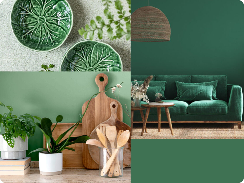
A symbol of fertility, success and harmony green doubles up as a warm and a cool colour. Refreshing and soothing to the eye, green works as an ideal backdrop in interior design because we are so used to seeing it everywhere.
The natural greens, from forest to lime, are seen as tranquil and stimulating, with a natural balance of cool and warm (blue and yellow) undertones. Also associated with health and fertility, green is a cool, relaxing color that also connotes a feeling of renewal and growth. It works well in living rooms, dens and bedrooms and is considered a natural, neutral tone.
Effect of the colour green: • Soothes and relaxes • Cools your nerves • Keeps you grounded • Refreshes and recharges
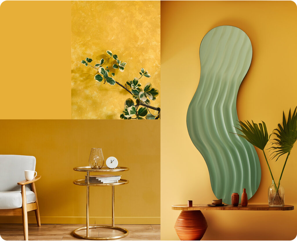
Feel the sunshine. The warmth and the joy as you go humming through your rooms feeling like you are on top of the world.
Sometimes it’s just a wee bit of yellow you need to raise your spirits and rediscover the bubbly you. A golden yellow to light up a much ignored closet space.A paler hue to add a bit of calm.A soft yellow to brighten a kid’s room. With yellow you can infuse surroundings with optimism and energy.
Also the color of happiness and optimism, yellow suggests positive, cheerful feelings and can be used to brighten practically any room. Yellow is great for “work rooms” such as kitchens and laundry rooms.
Effect of the colour yellow: • Adds cheer • Makes the air more relaxed • Stimulates the senses
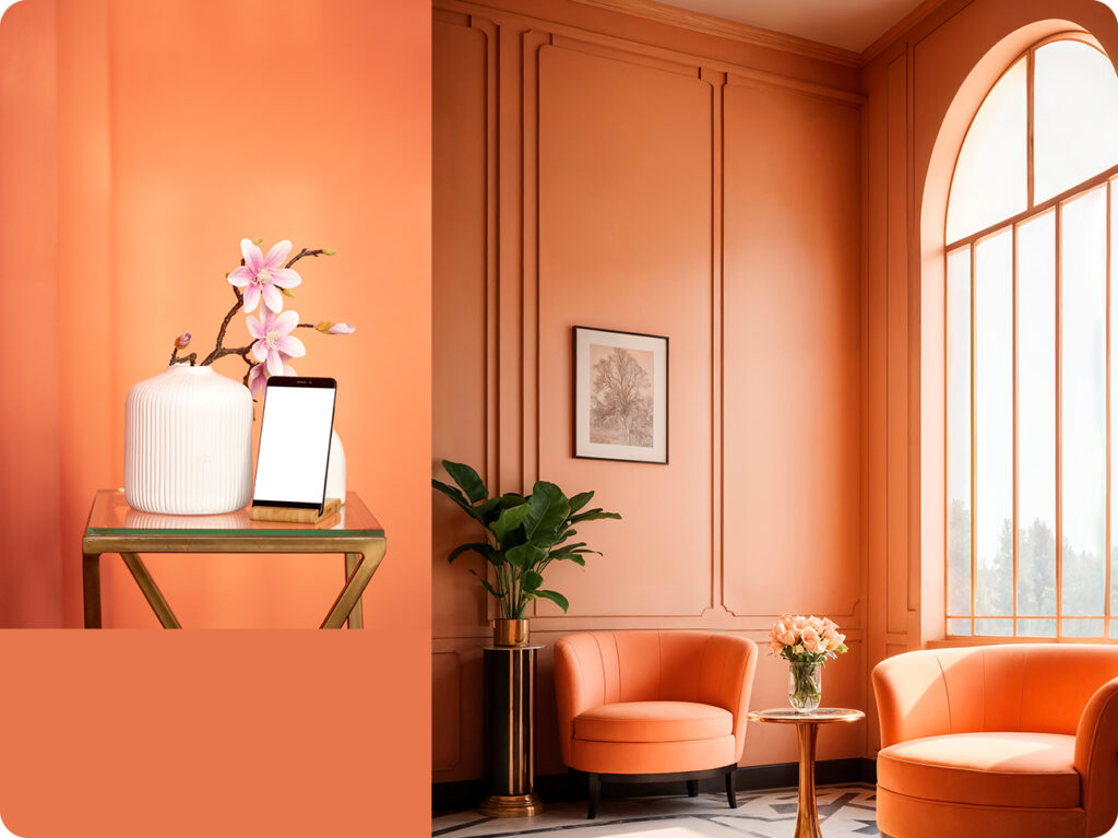
This close relative of red adds fun and flamboyance, warmth and energy to every situation. A colour that connotes ‘get what you pay’ philosophy can make or mar a business. Some of the tones of orange such as terra cotta, peach or rust have very broad appeal.
Often considered also as the most social color, orange is the color of creativity and imagination. It works well in family rooms and dining rooms, as well as bathrooms where its peach tones help complement skin complexions.
Effect of the colour orange: • Encourages socialization • Makes life fast paced • Energizes you
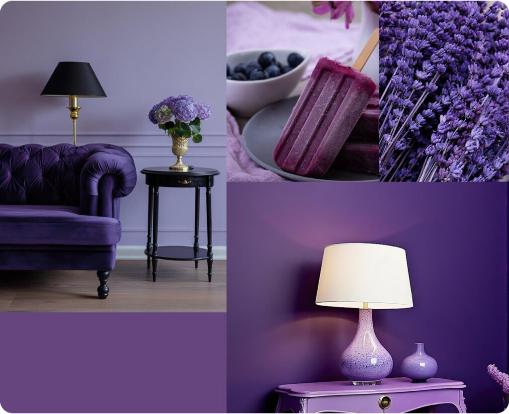
Want to give your rooms a delicate, sophisticated look? Or a colour which boosts your child’s creativity and aids concentration?
Purple is what you are looking for. Contrast it with a warm grey and you have a great at combination for the home office.
Deep or bright purples add richness while lighter purples give rooms a more romantic and delicate air. Because purple is derived from the mixing of a strong warm and strong cool colour it has both warm and cool properties.
Traditionally the color of royalty, purple tones evoke a feeling of luxury and nobility. This majestic color works well in bedrooms, living rooms and bathrooms where it can give a sense of lavish opulence
Effect of the colour purple: • Triggers creativity • Heals • Allows free thinking
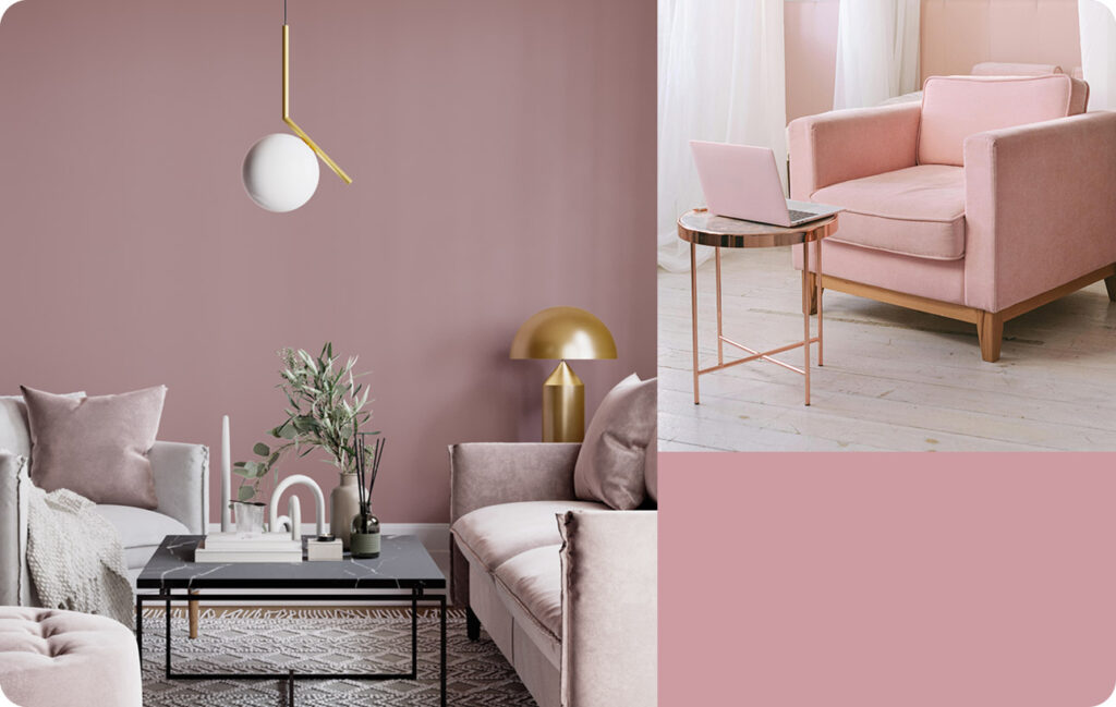
A pale red, pink is associated with a delicate, feminine look and is used to soften and lighten the look of bathrooms and bedrooms. Pink may be looked upon as elegant, refined and poised.
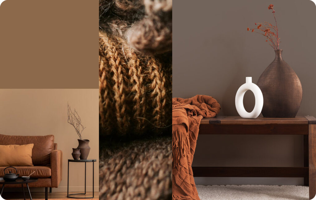
An earth tone, brown is the most natural of all colors and helps “ground” any color scheme. Brown is good for living rooms, dens and hallways. It works best with an accent color that will keep it from becoming too monotonous.